
Reading Bode Plots
Article 4 in the series on impedance-based stability analysis

Last week we established the Nyquist stability criterion — the test that answers, from two impedance curves alone, whether a converter and a grid will oscillate together. That test is exact and elegant. It is also, for practical engineering, incomplete.
Nyquist gives a verdict: stable, or not. But an engineer designing a wind farm connection or reviewing a vendor’s impedance scan does not just need to know whether the present design is stable. They need to know how much room there is before it isn’t. How much could the grid impedance rise before stability is lost? How much phase lag could a firmware update add before it matters? How does the margin compare at 15 Hz, where a sub-synchronous interaction might develop, versus at 200 Hz, where a high-frequency resonance might? The kind of information less straightforward to see with a Nyquist plot.
These are questions about quantity, not kind — and they need a format that lays that quantity out for the eye to read, frequency by frequency.
That format is the Bode plot. And the two numbers it yields — gain margin and phase margin — are the most widely used stability metrics in the entire field of IBR connection assessment.
Unfolding the Nyquist plot
The Bode plot and the Nyquist plot contain the same information. They are two ways of displaying the same loop gain — the impedance ratio from Article 3. The difference is how they lay it out.
A Nyquist plot puts magnitude and phase together into a single polar trace in the complex plane. This makes the encirclement test beautifully visual, but it compresses frequency into the position along the curve, which means you cannot easily see which frequency is responsible for a particular feature. Two points that are close on the Nyquist curve may be far apart in frequency.
A Bode plot separates them. It displays the same loop gain as two curves stacked vertically, both against a logarithmic frequency axis: magnitude (in decibels) on top, and phase (in degrees) below. Every frequency gets its own column. This separation is what makes margins readable at a glance.
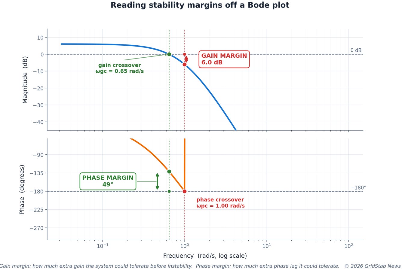
Figure 1 makes the reading explicit. Two crossover frequencies matter. The gain crossover is the frequency where the magnitude curve passes through 0 dB — the frequency at which the loop gain is exactly one. The phase crossover is the frequency where the phase curve reaches −180° — the phase at which a returning disturbance would be perfectly aligned to reinforce itself, the −1 condition from Article 3.
From these two crossovers, the margins follow directly. The phase margin is how many degrees above −180° the phase is, measured at the gain crossover. It tells you how much extra phase lag the system could tolerate before the Nyquist curve would reach the −1 point. The gain margin is how many dB below 0 the magnitude is, measured at the phase crossover. It tells you how much the loop gain could increase before the curve would reach −1.
Both numbers answer the same underlying question — how far from the critical point? — but they answer it along different axes, and they can be read independently, at a glance, from the plot.
What good margins look like
There is no universal law that dictates the required gain and phase margin for a converter–grid interaction. Different TSOs, different vendors, and different application contexts use different thresholds. But a broad industry consensus has formed around the following:
A gain margin of at least 6 dB and a phase margin of at least 45° are generally considered the lower bound of acceptable. Below 6 dB of gain margin, a relatively modest change in grid impedance — a line outage, a neighbouring plant going offline — could push the system past the boundary. Below 45° of phase margin, the step response begins to show noticeable ringing, and any additional phase lag from a firmware update, a PLL tuning change, or a grid-strength reduction can erode the remaining margin quickly.
More conservative practitioners — and some TSOs dealing with particularly challenging weak-grid areas — require 10 dB gain margin and 60° phase margin. At the other end, designs in constrained environments sometimes accept 30° phase margin as workable, but with the understanding that this leaves little room for the parameter variations and model uncertainties that exist in any real installation.
The key point is that these numbers are engineering judgments, not physical constants. A margin of 45° is not safe in some absolute sense; it is a convention that reflects decades of experience about how much real systems tend to deviate from their modelled behaviour. The appropriate margin for a given project depends on how well the impedance data can be trusted, how much the operating point is expected to vary, and how severe the consequences of instability would be.
—— YOU ARE ~30% INTO THIS ARTICLE ——
What follows behind the paywall
● Three systems compared — healthy, marginal, unstable — showing how increasing the impedance ratio erodes margins until they go negative (with diagram).
● How engineers actually read margins in practice — from the two impedances plotted together, where the magnitudes cross and the phase gap tells the story (with diagram).
● A real case study — the BorWin1 high-frequency oscillation event of 2015, and how impedance-based post-mortem analysis showed the phase margin was negative in the band where the oscillations actually occurred (with diagram).
● The boundary of the Bode approach — what margins cannot capture, and the simpler condition that sidesteps them entirely (setting up Article 7, on passivity).
Subscribe to GridStab News to unlock the full article and the rest of the series.
